Using Dynamic Backgrounds to Improve Adobe Connect User Experience
October 16, 2017
Back to Black
An often overlooked feature of Adobe Connect is its ability to provide stunning and engaging custom layouts. Using a little black magic it’s possible to get beyond the static custom background wallpaper, and provide a dynamic background which appears to participants as changing to highlight the theme of the topic at hand, be it in a virtual meeting, collaboration session, or eLearning virtual classroom. This article will show you how!
The key to understanding how to make the Connect room look best for your participants it understanding how Connect resizes pods. This powerful feature is what lets Connect accommodate different devices and displays. Connect does this without you having to worry. The way it works is that once a Host has arranged pods in the room they way they want, Connect then resizes those pods depending on the participants’ display. Even more impressively this resizing is done without distorting the contents of the pod. Connect accomplishes this by adding “black borders” above and below, or to the right and left of the pod contents as necessary.
By adding a black background to images shared in the share pod, and by selecting the Hide Title Bar option for the top of the pod, you can effectively make these added border disappear, yielding a more seamless visual effect.
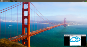
Here is a room with a logo in a share pod, where the logo has a white background before Hide Title Bar has been selected from the drop-down menu at the top right of the pod. You can see the black bars to the right and left of the logo, and you can see the title bar showing the file name of the png image.
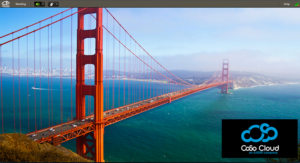
Here is the same image room after hiding the title bar and putting the logo on a black background. It looks much better already.
Now if we select an image for the background wallpaper that has some black space, and we make sure the logo image int he share pod appears over the black space by anchoring the background black space to the appropriate corner, all of a sudden the logo appears to be a part of the background.
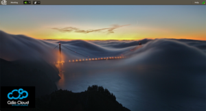
Taking this a step further can provide a very dynamic and engaging overall effect. By making some or the majority of your background image black, the share pod can be used in conjunction with the background to make images appear to move and change size to highlight topics as you go from layout to layout. One thing needs to be kept in mind to make the most of this. Ideally you want the share pod with the image in question to alway appear over part of the background wallpaper image that is black, this way you see no borders and the image appears to be part of the background. This is easily accomplished by anchoring the non-black part of your background, and keeping the share pod on the opposite sides of the screen.
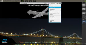
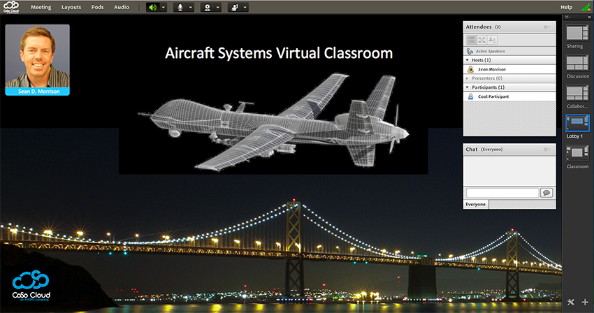
In this example, we pick a theme image of an aircraft. Following the above steps, we get the image on a black background and add some text that goes with the theme of the room “Aircraft Systems Virtual Training” then select a wallpaper for the Connect room that has a lot of black space.
We can then move the image around for different layouts, in some it’s large and in the center, and others it’s small. In all cases, Connect resizes the share pod automatically and by hiding the Title Bar and keeping it on a black area, it appears to be a seamless part of the background and can be used in different layouts, like your lobby layout…
or your virtual training layout.
Finally, it’s worth noting that it is possible to change the background image entirely without restarting the room. This take a second and is best facilitated by someone in a producer role so as not to break up for the flow of material, but it is a feature that is often overlooked.
