4 Quick Tips To Create Visual Impact in Adobe Connect
March 16, 2017
With a virtual classroom, one of the most exciting benefits is the ability to customize. One of the most common questions customers ask is how to quickly add visual impact. The great news is Adobe Connect has great tools easily handy to create impressive visual presentations. Below are 4 quick tips to up your game and achieve maximum visual impact in your Adobe Connect rooms.
1. Background Wallpaper
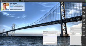
Adobe Connect is capable of displaying fantastic high definition images as background wallpaper. The ideal size is 1920 x 1200. Find some images that you like using Google Image search, and sort by Large, then use a simple tool like Microsoft Paint to re-size or crop the image to display a nice 1920 x 1200 formatted selection. Pick a few and we’ll test them to see which works best in your Connect room.
Make your image more relevant by adding your logo or message (or both!) to it. For example, I found a classroom image, trimmed it to 1920 x 1200, and then used Microsoft Paint to “write” a personalized Welcome Message on the chalkboard. I also added a logo.
One of Connects best features is that it renders your room to display on virtually any device. It does this by adjusting the dimensions of the pods so that they are displayed the same distance apart and correctly in relation to each other regardless of the aspect ratio of your screen. Some screens are tall and thin while others are short and wide. The easiest way to ensure your background image appears correctly in relation to pods on most screens is to place your logo in a corner, and “anchor” the corner that has the logo. This way you can be sure that so long as you don’t cover the logo with pods, it will appear on all types of screens.
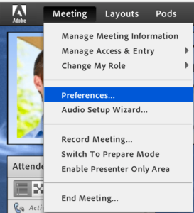
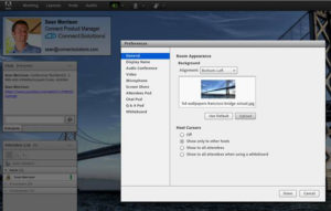
You can upload your new background(s) and pin the correct corner by going to Preferences in your Connect Room and under General selecting Upload and ensuring Alignment matches the corner where your logo is.
2. In-Room “Business Card”
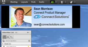
Having your personal presence visible in the room will also be visually impactful and is one of the best ways to keep people engaged. The best way to do this is to make use of the Camera and Voice Pod. Many people are not comfortable being on camera or do not have a high-quality webcam with adequate lighting. The next best thing is to include an in-room “business card” that incorporates a photo.
This is also quick and easy but here are a few tips to remember to make sure things look their best.
Select a background color of your business card that matches the overall theme of your room. Alternatively, select black as the background color of your business card. The reason black works well in the context of Connect is that when Connect re-sizes the pod to display your card on screens of different aspect ratios, it does so by adding black at the top or at the sides of your image. These black bars essentially become invisible if you use a black background.
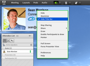
After you use a Share pod to upload and share your business card in the room, hide the title bar or at least change the name of the pod to your own name or something that matches the image instead of just the default file name.
3. Camera
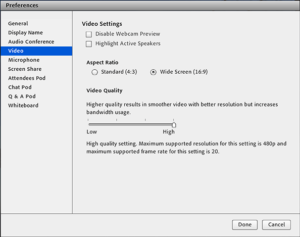
Adobe Connect support widescreen camera, so if you have a fast Internet connection and a good camera select Wide Screen (16:9) as your Aspect Ratio and move the Video Quality slider all the way to High. These can be found under Meeting > Preferences > Video. Make sure your camera is in focus and that your lighting is appropriate.
4. Layouts
Use layouts to make the most of your Connect room. No need to keep the pods obscuring the background wallpaper once you’ve made it beautiful and impactful. Be creative in where you place your pods and what aspects of the background you display. Pre-select layouts to make the most impact.
